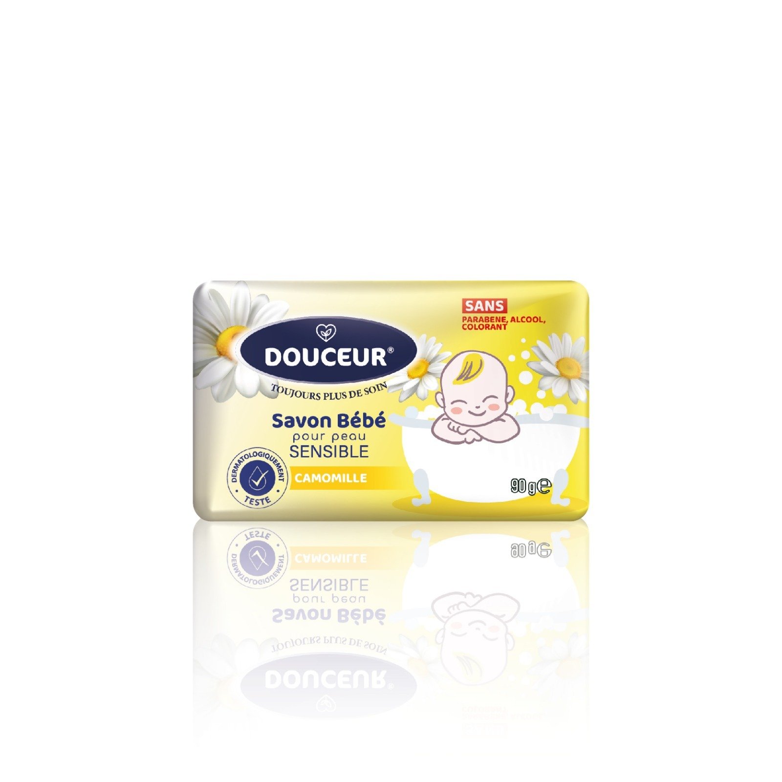
This professional commercial visualization showcases a single bar of Douceur Savon Bébé Camomille. The image is presented as a clean packshot against a stark white background with a soft, realistic reflection below the product.
Design & Visual Elements
-
Color Palette: The packaging features a bright, sunny gradient of yellow and cream, reflecting the calming and gentle nature of chamomile.
-
Floral Imagery: Large, realistic white chamomile flowers with yellow centers are positioned on the left and right sides of the bar, clearly identifying the scent and main ingredient.
-
Character Illustration: Centered on the right is a cheerful cartoon baby resting in a white bathtub filled with bubbles, creating an emotional connection with parents.
-
Logo & Typography: The DOUCEUR® brand name is centered in a dark blue oval. Below it, the text “Savon Bébé pour peau SENSIBLE” (Baby soap for sensitive skin) is displayed in clear, legible blue and green fonts.
Product Features & Marketing Specs
-
Ingredient Focus: A yellow horizontal banner at the bottom left explicitly states “CAMOMILLE”.
-
Safety & Pureness: A red text box in the upper right corner highlights the “SANS” (Free from) claim, noting the absence of parabens, alcohol, and colorants.
-
Professional Certification: The “Dermatologiquement Testé” (Dermatologically Tested) seal is placed on the bottom left, providing quality assurance.
-
Weight & Scale: The net weight is indicated as 90g e. The lighting is cinematic and even, ensuring all text is sharp for high-resolution e-commerce or catalog use.
Reviews
There are no reviews yet.